
assessing the landscape
After understanding the goals of the site, my first step was to see
how other successful insurance companies had positioned themselves
through branding and website user experience. This discovery phase
is coupled with design research. I visited a number of boards,
portfolios and blogs for design and code examples that might help me
with my growing vision to create a strong and modern UI that conveys
confidence and assurance.
talking points
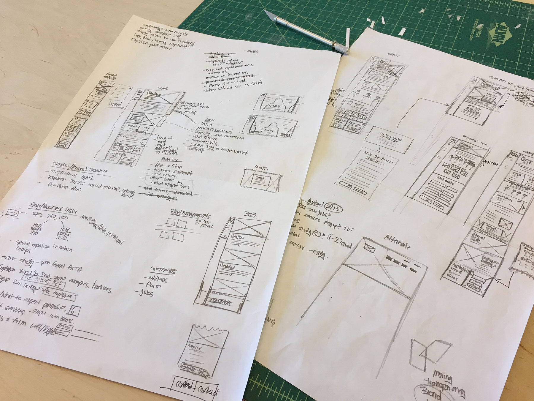
My next step was to quickly iterate these ideas as rough sketches to
see which might hold promise. These helped to organize my thoughts
in terms of content structure and flow. It also provides a framework
for me to anticipate what imagery and content I should request from
the client and which photos we need to source ourselves. I regularly
take notes listing objectives and adjectives that encompass the
brand. To obtain greatest efficiency I follow a set streamlined
process, but I also try to stay flexible to each client's
particular needs.
presenting the layout
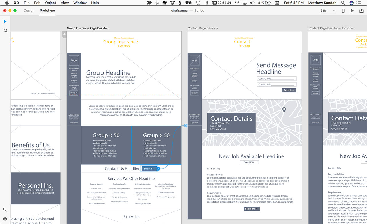
After the internal team had challenged and refined my ideas I made
further adjustments before creating and presenting higher fidelity
wireframes to the client. By working in Adobe XD I was able to
create and prototype user flows in order to show how each page
relates to the other. I managed the online prototype links which
also catalogued client feedback.
design
I was involved in every aspect of this website design including UI, UX, photo editing, illustration and animation. We outsourced the photography but I directed the shots as I pictured them working on the site. By shooting portrait shots on a green screen we gained the flexibility to add future employees to the same background for a consistent feel. All indications pointed to a more mature user demographic so at the desktop breakpoint I decided to use a familiar fixed vertical navigation in order to keep menu options top of mind.